 Plotting
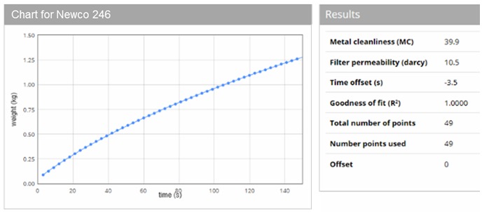
Raw data and process model curve fit to Prefil data
The raw data from the Prefil test can immediately be compared to the model prediction based on the filter permeability and metal cleanliness MC which have been determined. The “chart” link in the list of tests will display this comparison. In the example below, the blue circles are the raw Prefil data, whilst the solid blue line is the model prediction. In this case the filter permeability was determined as 10.5 darcy, whilst MC = 39.9, with goodness of fit R2=1.0000.
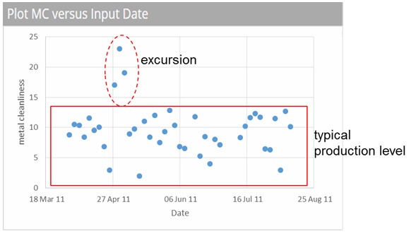
MC vs. date
The List view provides check boxes to select some or all of the tests. These can then be used to plot MC values as a function of test date (accessed under the “Charts” menu). This can be very useful to establish the stability of the cleanliness level over time, and allow an immediate visual appreciation of when a test is giving an MC value very different from normal production.
MC vs. PoDFA
For each test, a total PoDFA inclusion count can also be appended (if you have the data), which will allow you to build up a correlation between MC values and the typical PoDFA levels (mm2/kg) found for your particular population of inclusions. Having selected these tests from the list, a plot of the correlation can be created, from a command under the “Charts” menu.
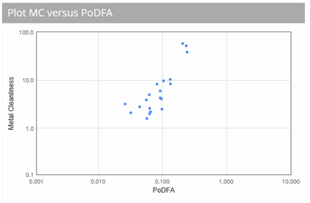
It is worth noting that the typical errors associated with PoDFA measurements become very large as metal becomes cleaner. Values have been quoted of +/- 40% for a PoDFA level of 0.1 mm2/kg, which will increase to +/- 70% for levels of 0.01 mm2/kg, and 100% for levels of 0.001mm2/kg. The Premetz analysis determines both a measure inclusion loading (specifed in MC units), but also provides a measure of the uncertainty in the MC value (expressed as a 2 sigma error). For clean metal (MC<10), the MC error is typically <1, whilst for dirty metal (MC ~ 100), the error is typically <5.
Raw data and normalised curves
Having selected a sub-set of tests using the check boxes, there are two further ways to view the data, also found under the “Charts” menu. “Plot raw data” simply shows the original raw Prefil curves as recorded (each test shown as a continuous line). Alternatively “Normalised curves” re-plots the curves, but on the assumption each test was run with an identical 11 darcy filter. As an example, the two plots below show the raw data and normalised curves for 29 tests taken after the filter from different casts.
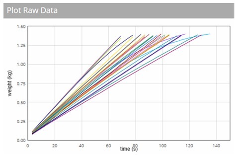
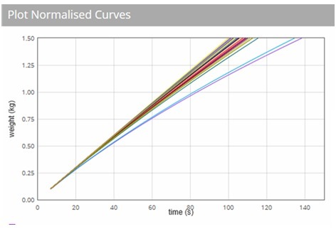
It is immediately apparent that the visual appearance of variation in metal flow through the filter is completely dominated by the variation in the permeability of the filter itself: it is very difficult to discern differences in behaviour in the “raw data” plot (left). However in the “normalised curves” (right), it immediately evident that the majority of tests are falling in a very tight grouping, with 2 tests showing significantly more resistance to flow.
These sort of data show unambiguously that, without using Premetz, interpreting raw Prefil data can be fraught with difficulty, or even impossible.